Developed for Branding and Identity Design in 2017, Lasts was designed to conceptualise the two sides of a shoe-care and socks business, targeting a niche market that demanded a high quality product. The brief from the subject was broad enough that we could tackle any service or product, as long as filled the requirement of having a niche market. Utilising the product knowledge from my retail work history at Clarks, I was able to use personal experience for what customers valued and looked for in those products to inform the final identity.
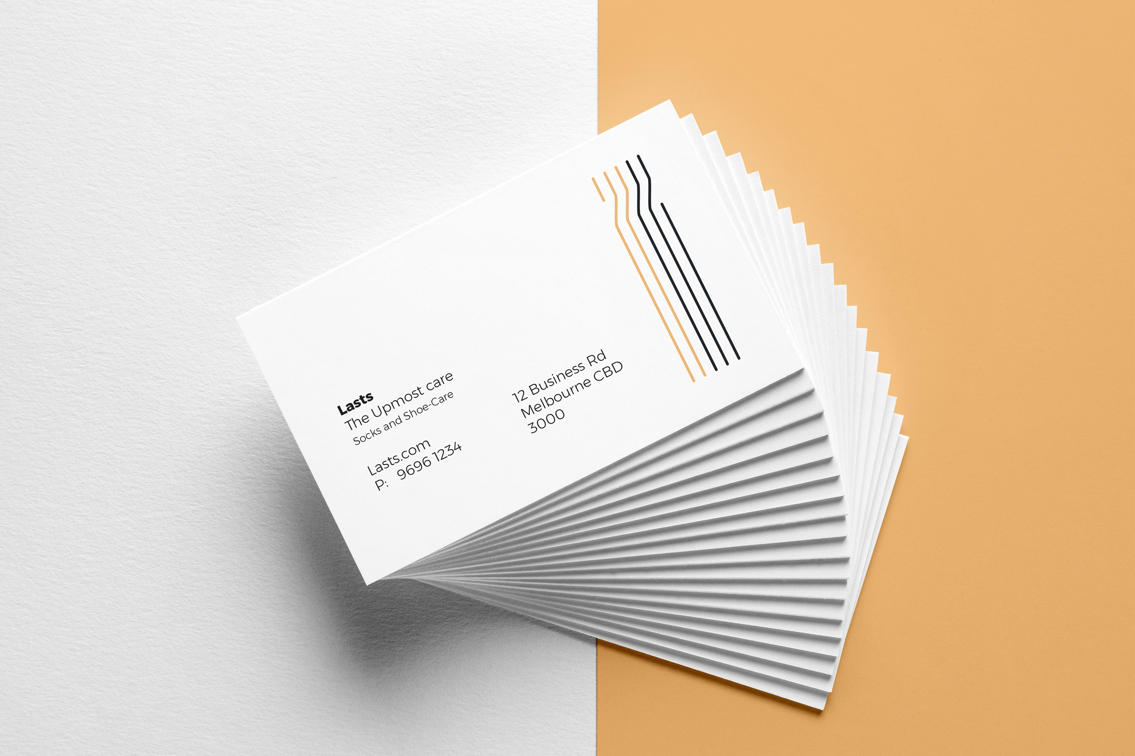
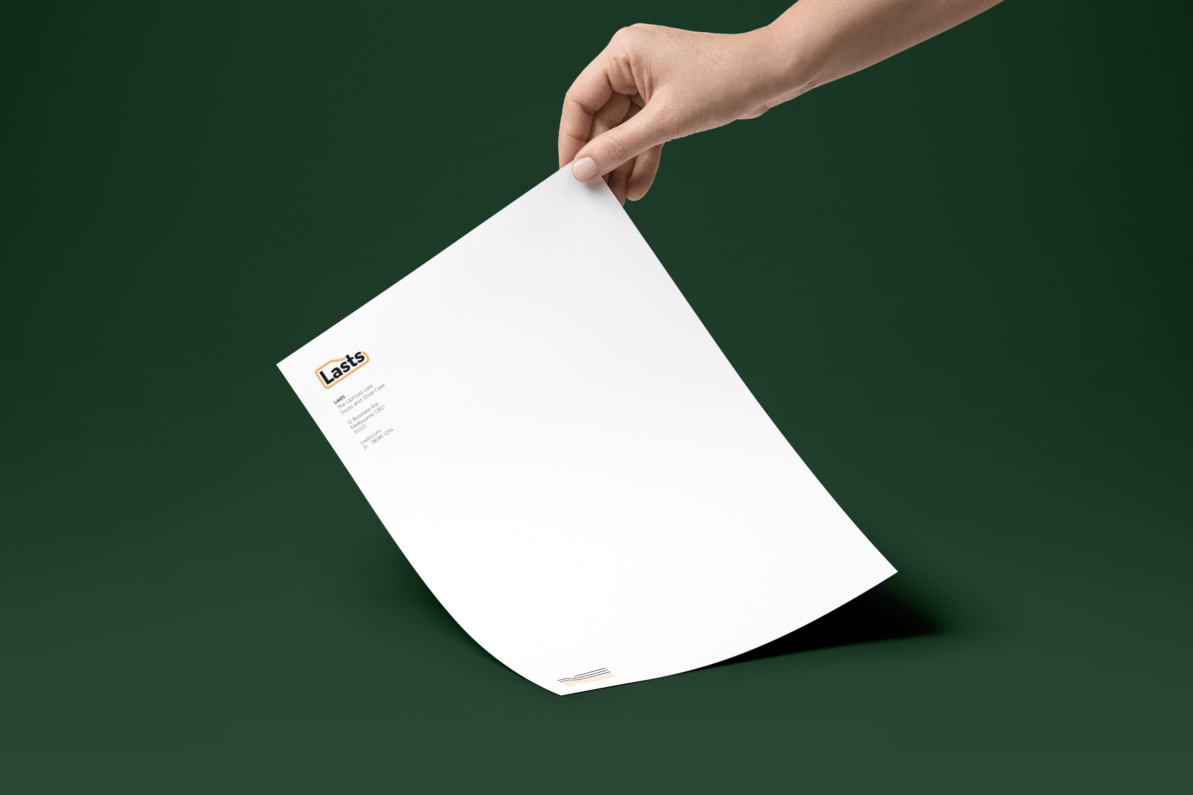
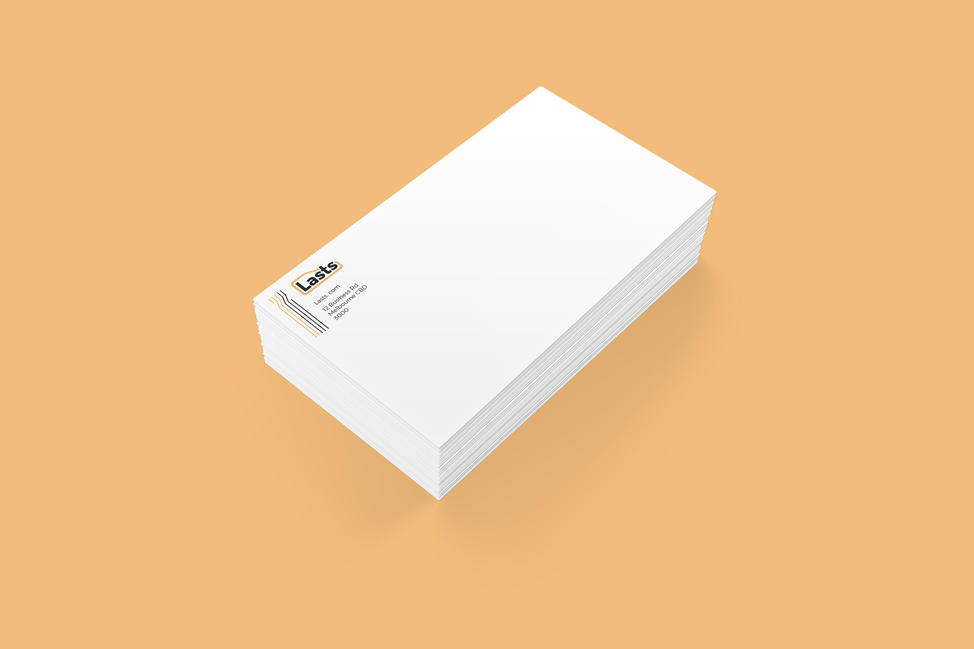
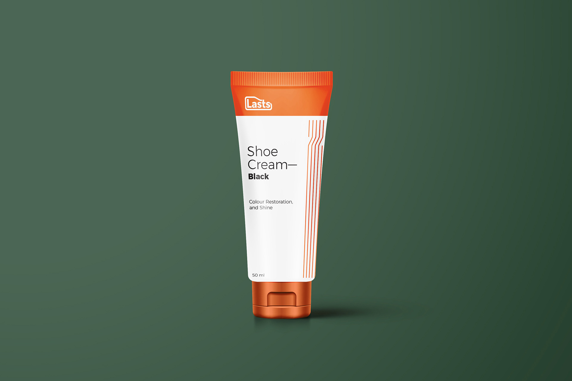
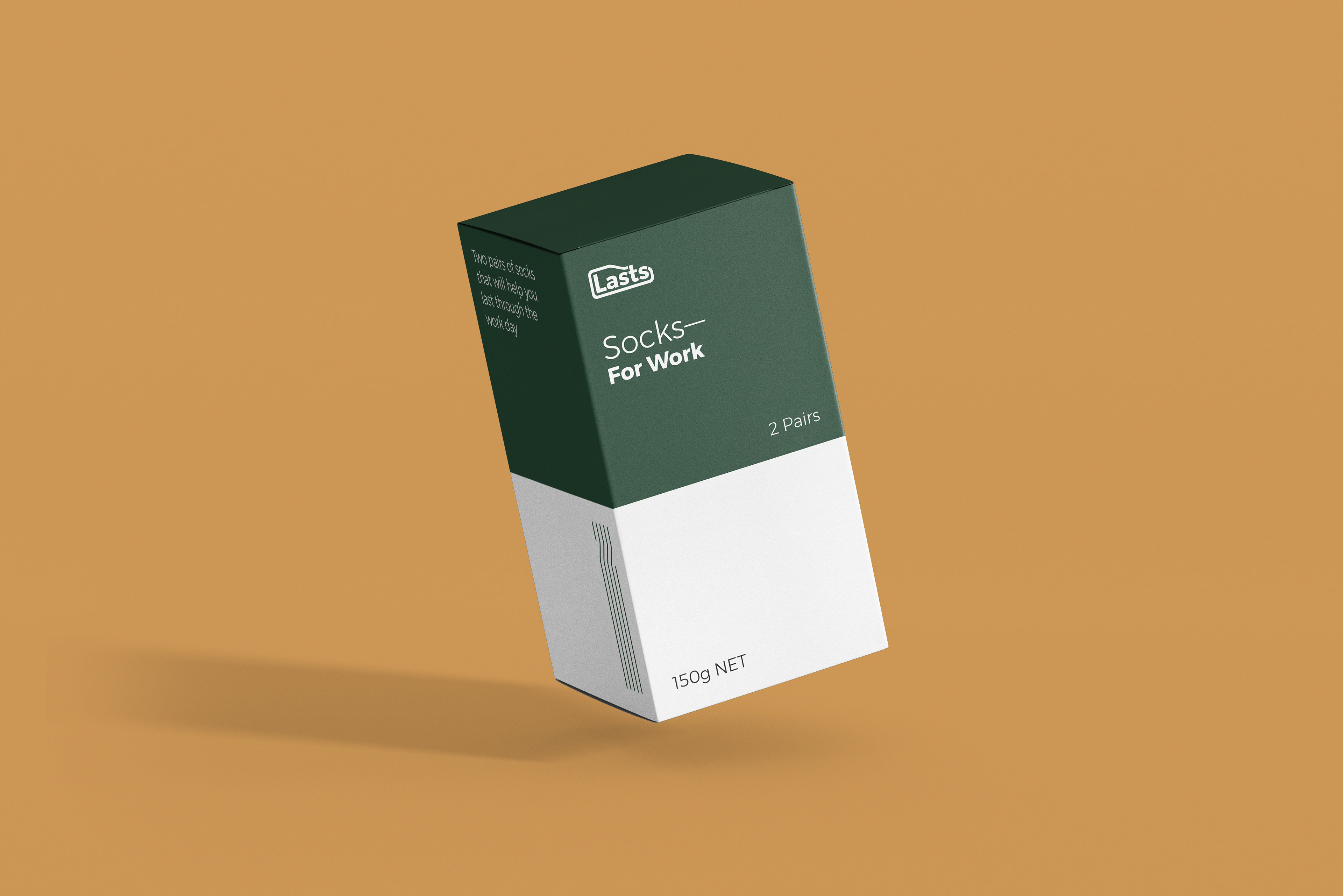
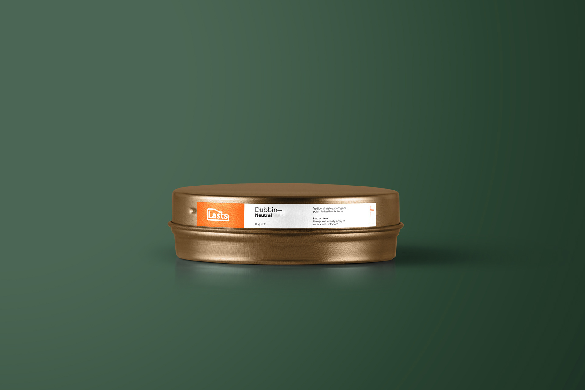
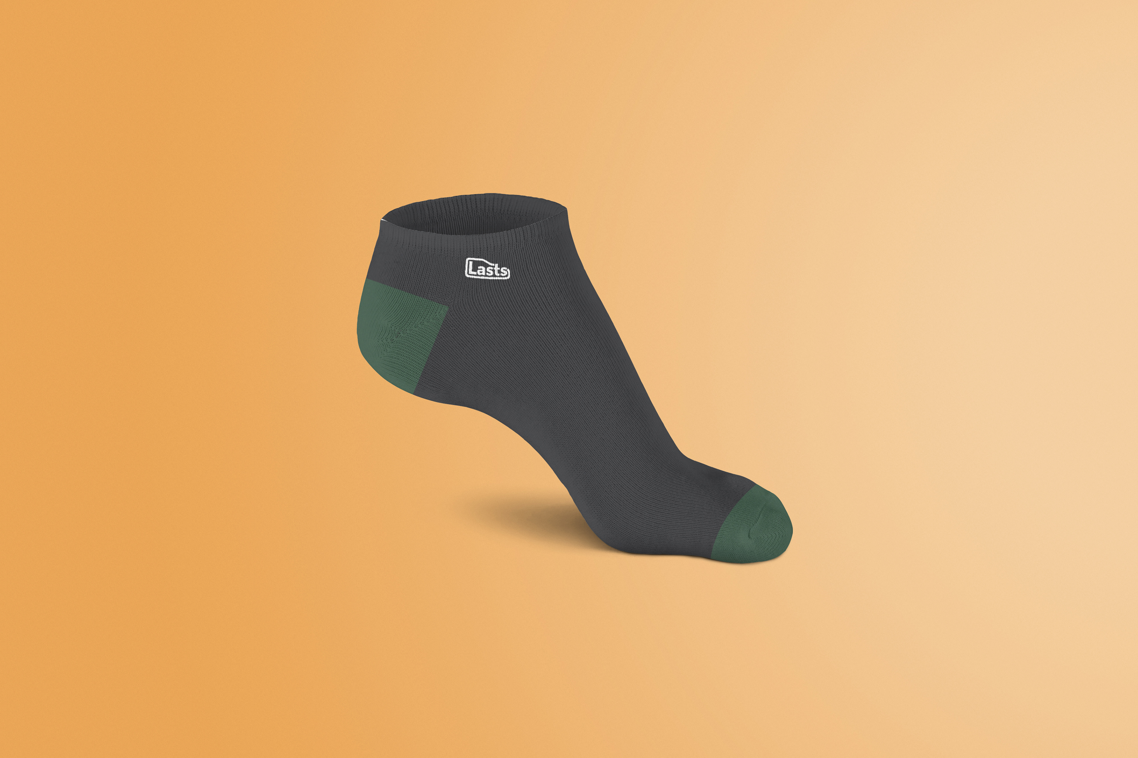
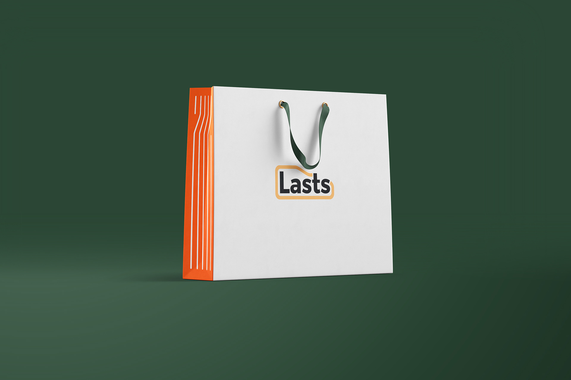
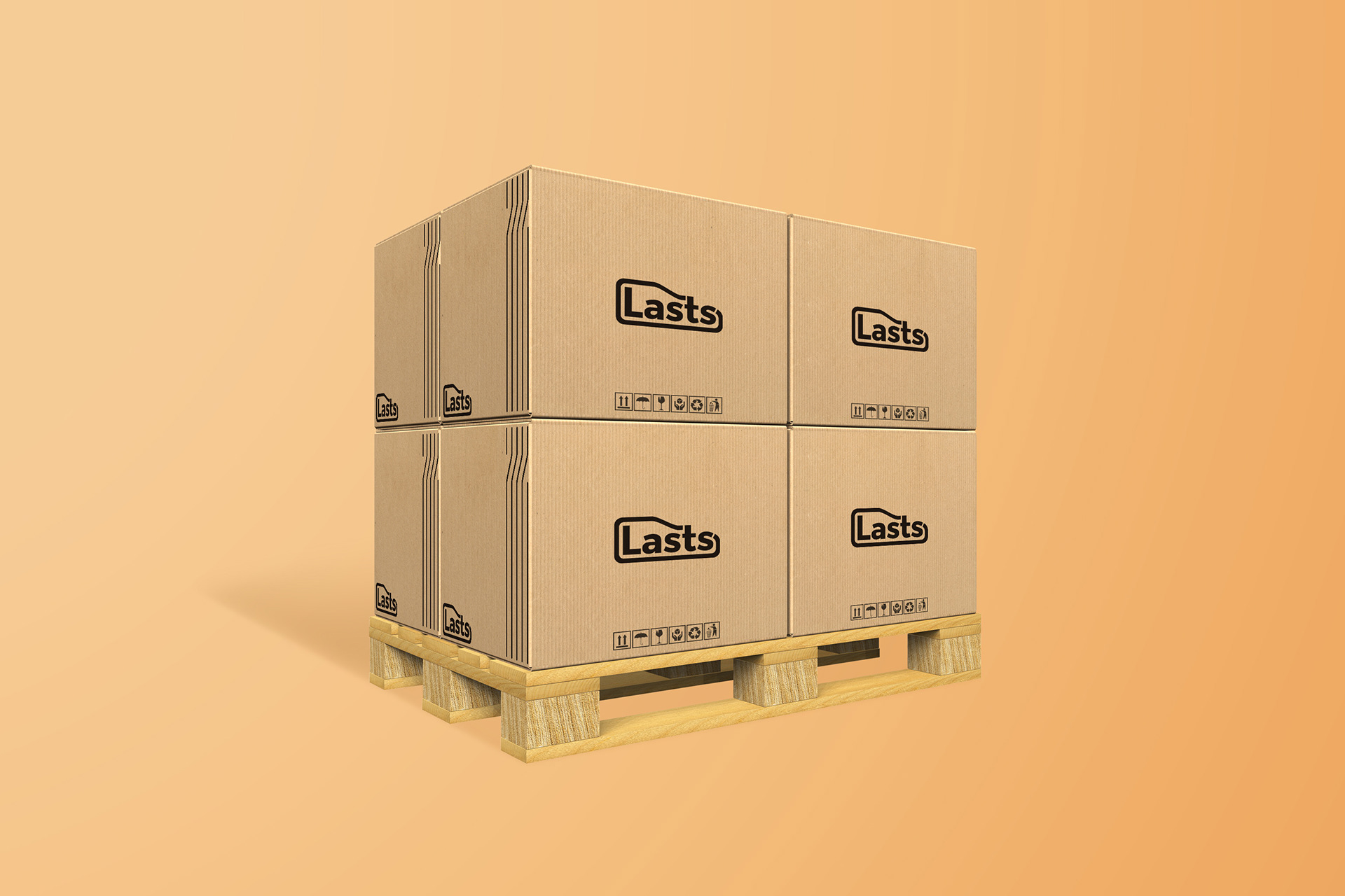
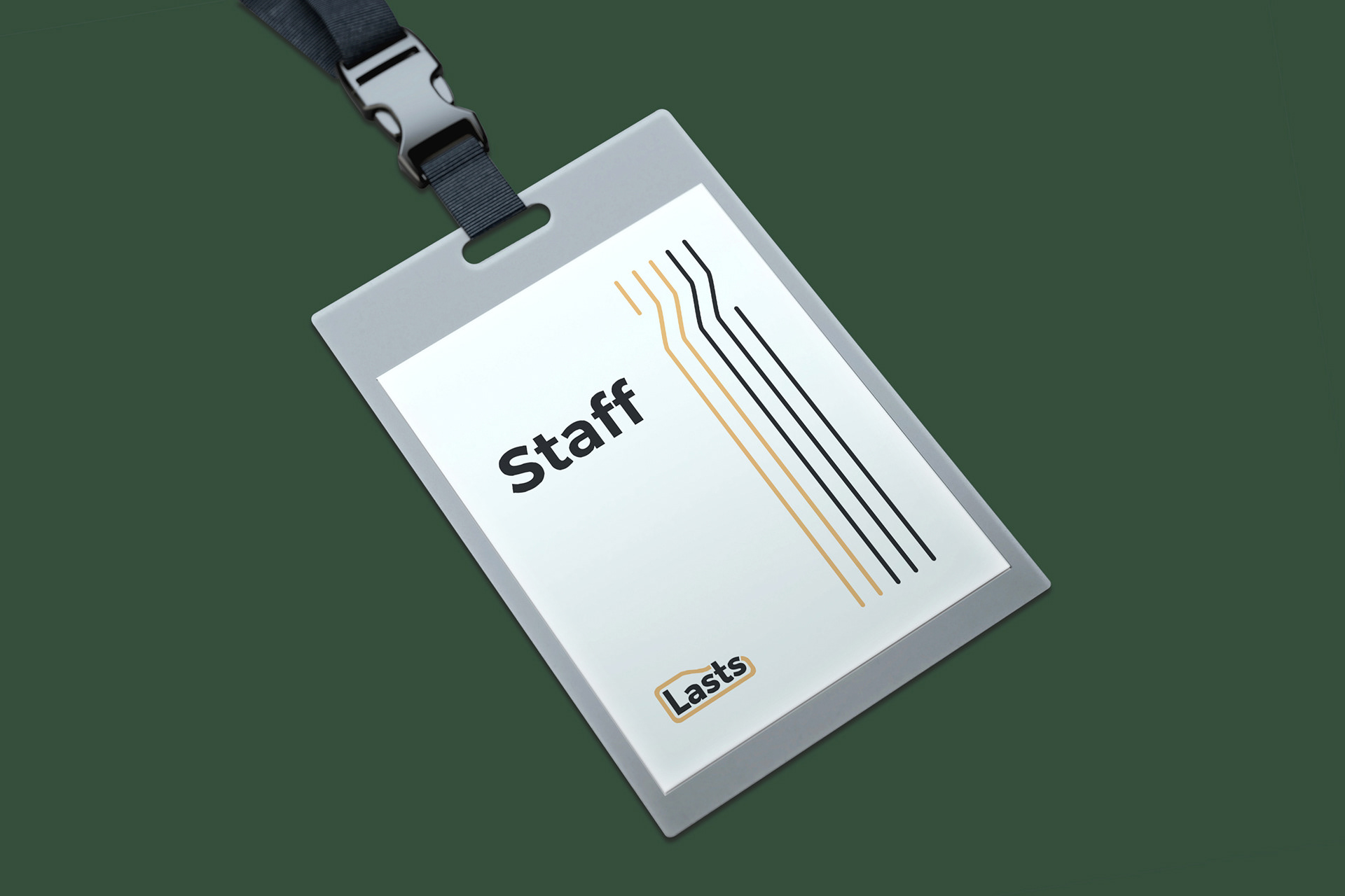
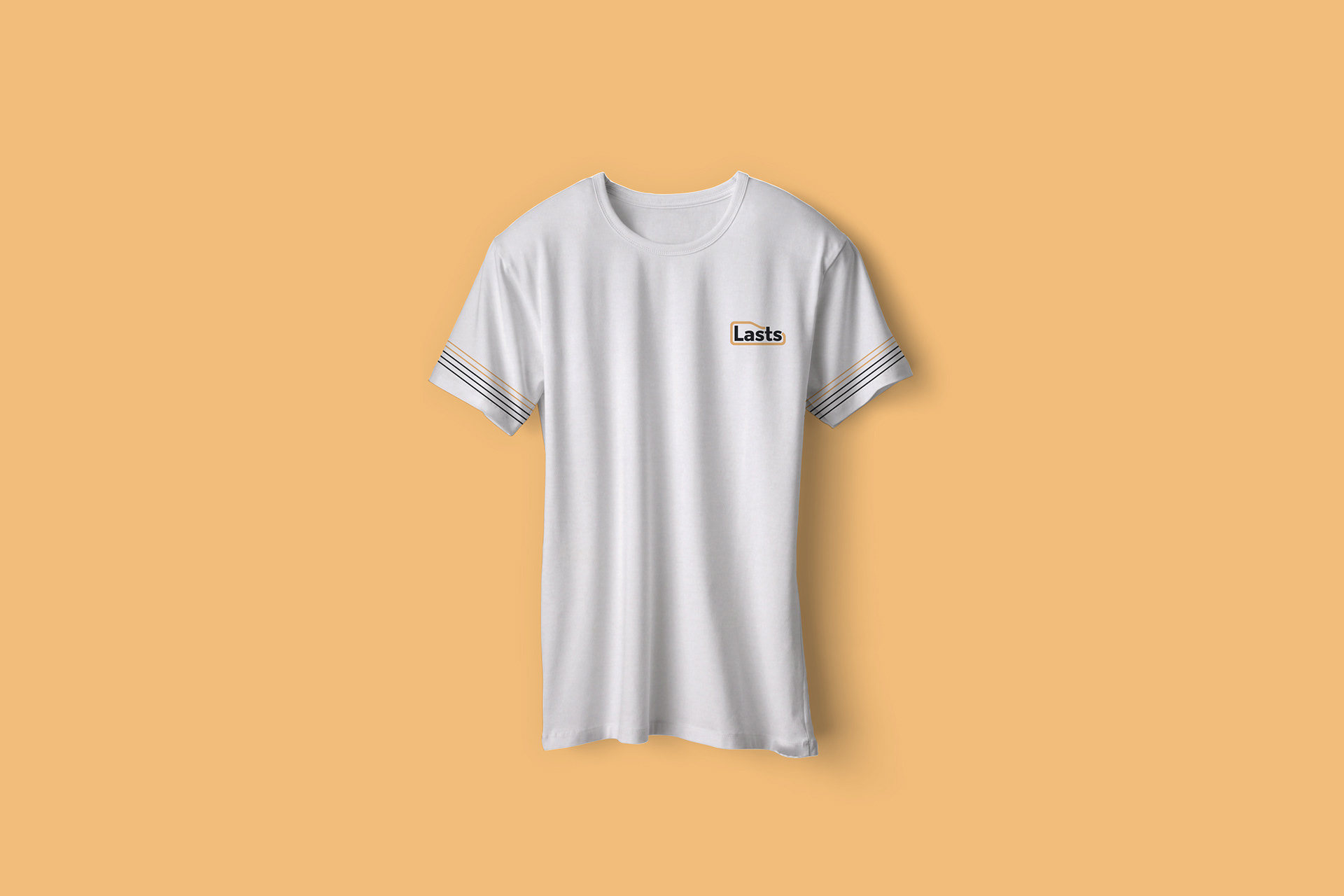
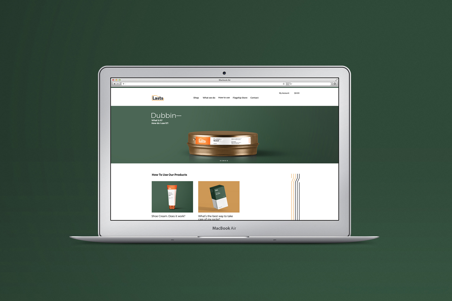
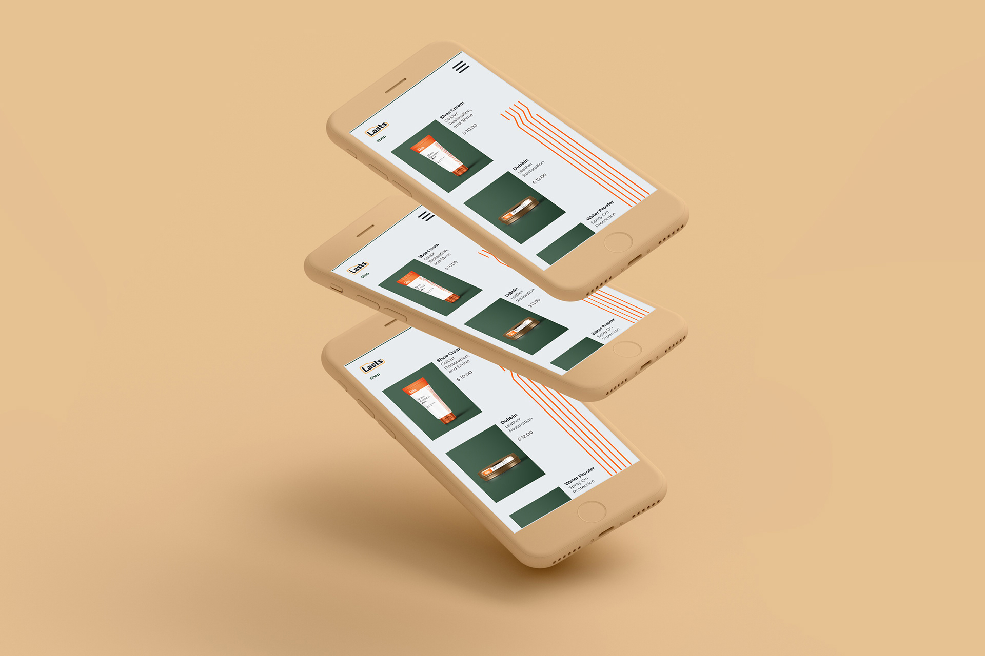
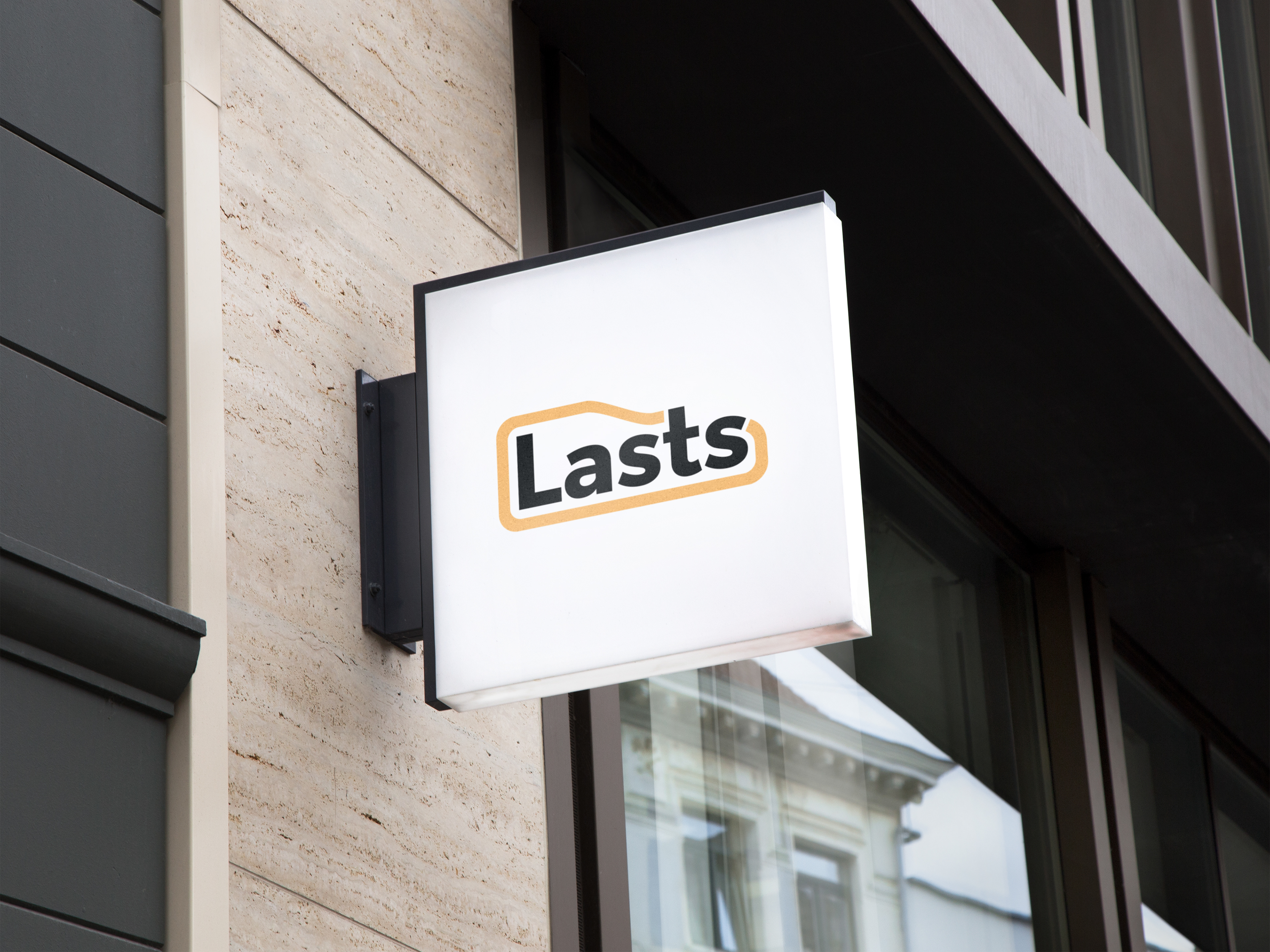
As a concept, it divides the two product lines through use of colour, with orange tones tied to shoe-care, and deep greens used socks. Together, the warm tones invite trust, and the graphic imagery invokes traits of quality and refinement. The brandmark is derived from the shape of a ‘last’, an impression of a foot that is used in the construction of a shoe. Creating a double entendre, it mirrors the meaning with shoe-care and socks as they are typically the last step in the process of taking care of your feet and shoes.
In terms of the unit, this identity system allowed me to achieve 98/100 for the entire unit, which has opened opportunities such as being elected to participate in the SUFASIA project.
Identity design and documentation book
—
—
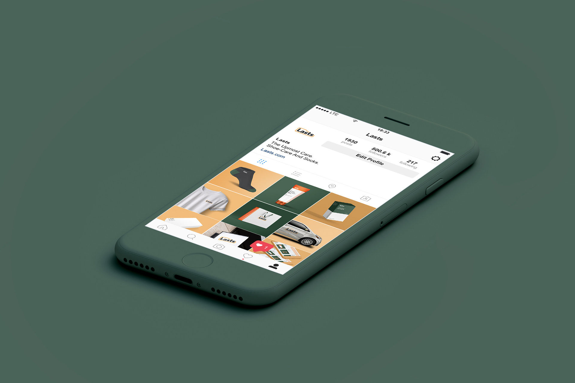
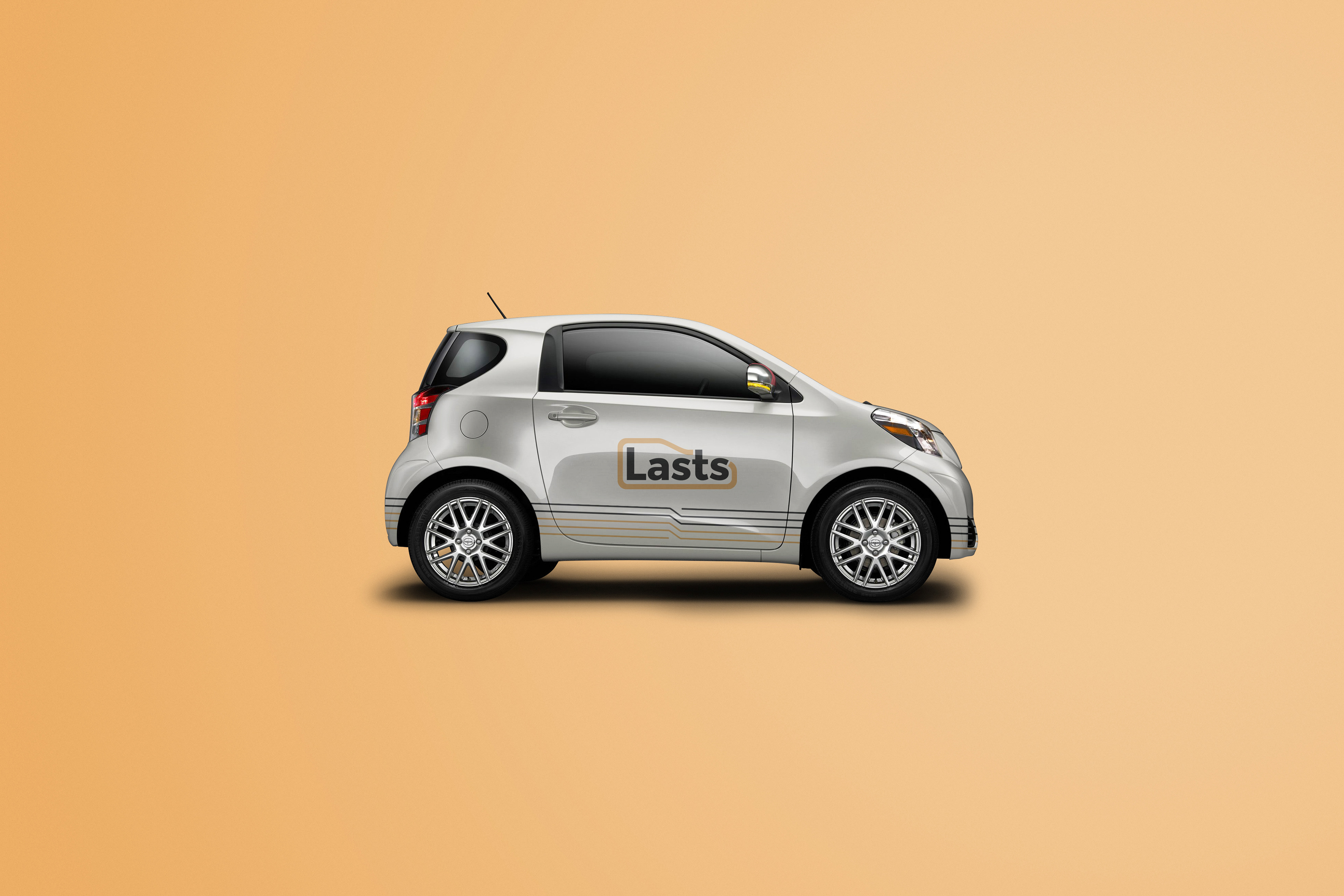
Collateral
—
—